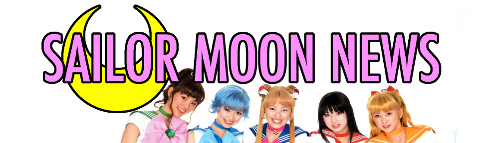
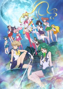
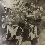
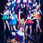
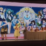
We’ve got a lot of official art for the upcoming new episodes of Sailor Moon Crystal which include Sailor Uranus, Neptune and Saturn. These come to us in the form of an image from the official site and art from the cover of notebooks and folders showing new designs for Sailor Moon Crystal. We had previously shown a black and white version of the main image, as it had been seen in a magazine photo. We can now confirm this image’s authenticity as this was posted to the animation section of the official site.
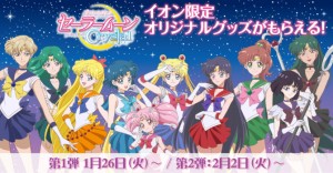
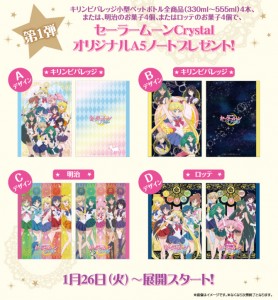
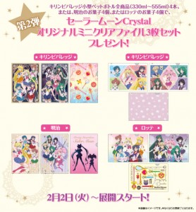
In addition some Sailor Moon stationary items have been revealed on the official site with art of the new characters. This includes a large image showing the full cast as well as a series of smaller images which are of notebook covers and clear file folders, many of which show the new characters Sailor Uranus, Neptune and Saturn.
What do you think of the new art style? I find it a bit odd that there is almost no shading on any of the characters’ faces. In one image I would think maybe this was just the lighting of that specific scene, but this seems consistent over all of the images seen today. Even the clothes themselves are almost all white with little shading on them. The image lacks a certain sense of depth and doesn’t look like something I would expect from official art. The variable thickness of lines makes for an interesting look which I like. I think Hotaru’s hair looks a bit short, but changing the style a bit really isn’t something I’m concerned about.
We should see more on Wednesday with the live streaming event. Stay tuned!
Possibly Related Posts
-
 The Infinity arc of Sailor Moon Crystal is officially being referred to as “Season III”
 -
 Art from a Japanese magazine seems to show Sailor Moon Crystal’s versions of Sailor Uranus, Neptune and Saturn
 -
 Check out the cast and poster for the Sailor Moon Un Nouveau Voyage musical
 -
 Viz’s new English voice actors for Sailor Uranus, Neptune and Saturn and more revealed at the Anime Expo Sailor Moon Panel
 -
 Sailor Uranus and Neptune S. H. Figuarts as well as Sailor Mars and Jupiter Figuarts Zero figures revealed
Yeah, Hotaru’s hair does seem shorter, but it’s Michiru’s hair that I think really draws attention. It’s pretty long. Then again in the manga I think her hair was long too, so…
i didnt really mind them shortening saturns hair, what bugged me the most is … well I cant tell but the pictures loooks really off somehow. And I love that Neptune gets her long hair
In the upcoming episodes, I can’t wait to see either Sailor Moon or Mars hold Chibiusa in their arms, and beach scenes or episodes.

Is there some specific reason why you want to see Chibi-usa being held in someone’s arms?
Well, maybe because she could get in trouble.
There’s something odd about the faces, I don’t know if it’s a lack of shading or there’s something wrong with the eye size (they look too big and its especially pronounced on Chibiusa) or if it’s something in the face shape. I do like Hotaru’s hair, though. It looks better than the classic cut.
However the girls wind up looking, I hope this next installment of Crystal takes some time to work on the overall flow of the story. The pacing last time was bad, the series felt disjointed, even when the individual episodes were enjoyable. If I didn’t already know the story so well, I’d have felt like I was missing important episodes somehow.
i think it looks odd because their necks are set a bit farther back than they should. that and their faces are much softer/younger looking. overall i’m liking the new style – i’m hoping that this is the start of something good!
I do not see any major improvement of the art… they practically did not change anything except their eyes and I even do not think it is a change in a good way… so from now on I do not have any expectations of better animation for what everybody is hoping… I lost hopes after seeing this, especially the second image is totally lame and horrendous and looks so amateurish… but still I am glad they are continuing the series and I hope they will continue and animate the whole manga
You’re right, Chibi-usa’s eyes look like Happy’s from Fairy Tail. Her head is too big and her neck is too small. She looks a little frightening. I hope the other children don’t look as bad.
Not a fan of the new artwork. Their eyes are googly and much more cartoonish and their mouths are like flat frog line mouths. The artwork for the first two seasons was spot on, the girls had much more delicate features, even though it never really got translated to the actual episodes…
0000000000444444444444444444440000000000000000000000404040404004404040400000004400000000444444444444444400000000000444400000000000000044444000000000004444444444400000000000000000000000000000000000000000444444444444444444444444444444444444444444444444444444444444444444444040440404040404040404040404040440404040404040404040400000000000000000000000000000000000000000000000000000000000000000000000000000000000000000000000000000000444444444444444444444444444444444444444444444444444444444444444444444444444444440000000000000000000000444444444444444000000000004444004040404040404000000000000000000000000000000000044444444444444444444444444444444444440000000000000000000000000000000000000000000000000
I guess that i could live with Hotaru’s hair even though i think that her hairstyle from the manga and original anime was a better fit for her personality. I really hate the mouths and like someone else already said this looks very off for being official.
However im still really hyped for the infinity arc and staying positive until we get to see some actual episodes
I noticed that Michiru’s hair is a lot longer now, and Hotaru’s is shorter. But did anyone notice how Setsuna’s hair is a lot greener and less purple. Before you could never mix Pluto and Neptune’s hair colors up; Neptune was blue green like sea foam, and Pluto’s was s sort of greenish purple, or purpleish green. Now the color is almost identical. And the faces of the main scouts are a lot less sharp than they had been, while the outer senshi have the more pointed faces. What exactly are they going for here? While I’m excited to see the new art, I’m rather disappointed in the execution. Haruna and Michiru’s hair length, awesome. Hotaru’s, no so much. And Pluto and Neptune (Setsuna and Michiru) need their hair color to be different.
Michiru’s hair are longest than usual, that’s weird Ô_ô .
But I really love the shade of purple used for Hotaru’s fuku =D . It really fits with her destructive power…
In the classic anime, Setsuna’s fuku was deep purple, whereas Hotaru’s fuku was indigo blue.
Personally, I didn’t like this. So it is cool that Toei has decided to go back to their original colors : black for Setsuna, purple for Hotaru. The black fuku has always been my favorite one.
Anyway, those artworks really look amateurish :/ .
Ugh, I hate them. I’m going to wait for my final judgement when I see it animated but I loved the way they looked before. Their mouths are just terrible now. I know many didn’t like their lips/lip gloss from before but at least it wasn’t just a huge line drawn across their face. I loved their eyes and colors in the first season as well but these look different and cheaper…plus they seem almost too far apart from one another. I’m not as concerned about the bodies as much or the hair of Saturn but their faces just look so weird to me now with their horribly cheap looking mouths.
I just don’t get why you would change it now? I understand getting more detailed and better quality with a new director based on feedback but the first two seasons and a very distinct manga feel and now it’s like completely different and just feels so inconstant. I think that’s what bothers me most…if it was like that from the beginning it would have been fine but it’s just too much of a change from something that was already made.
I just started watching the new anime and I don’t like this drastic change in style. The designs for season 1 and 2 were fine to me. Haven’t seen the whole series yet but I take more issue with the animation in the episodes themselves than the character designs. The character designs were fine except for some characters mosty male but sometimes female too and the cats. The animation in the actual episodes tends to be average at best and so far the quality hasn’t improved. The best animation seemed to be the first episode minus Luna.
I hope they don’t go with this design and instead improve upon the previous designs with better animation. I didn’t think I would like them with lipstick but it is much better than this. Now their arms and hands look small and this looks like some of the average animation quality that happens in the actual episodes. If I had to choose I prefer the previous style as it shared some of the style qualities of the manga. This style reminds me of the precure series I think that’s how you spell it. This style feels like it’s not an improvement over the previous style and I feel the animation might look even worse. Too bad the first season did not keep up the quality that they use for the I will punish stock footage from the sailor soldiers. I do not like Sailor Saturn’s haircut.
Where can we direct our complaints about these new character designs?
I will be honest as well and say I’m highly disappointed on the new art. The only one who looks good with the new look is Sailor Neptune. Sailor Saturn looks ridiculous with the short hair like that. I was truly hoping that this season/arc would look like episode 25.
This sudden change in the art style is giving me mixed feelings. I know a lot of people seem happy with the new art style but I preferred the original style and I was really looking forward to Neptune’s design in that style. I am happy they kept her hair long like it was in the manga but other than that I’m not 100% sold on this new look.
Hopefully seeing it animated may change that but it seems a bit unnecessary to change the arty style in the middle of of this. It’s one thing to adjust to the new style in comparison to the first anime but a new art style for the same series seems silly.
Going to try to keep an open mind on this though
I really dislike the new artwork!!!!
I am disappointed with this new style. The old character art was fine. It was the animation quality that needed to be worked on. This new character art just seems to take away the good artistic quality from the previous and looks like a different show. I hope this is not the final character art. From some of the photos they look disproportionate. Their new faces and look just feel off. From the standing pose wide photo with the dates, it looks even more obvious that this character art makes the show worse. Pluto’s face in that art is just bad. Their bodies have managed to look even more skinny and odd. I was hoping for better animation and maybe an evolution of character design, but this seems like the opposite of all that. I will stay positive, but these new images just makes me think the animation and style will be even worse off in season 3.
I looove sailor Uranus animation and I love sailor Neptune’s hair but I don’t feel the same about sailor Neptune’s face I don’t know it just doesn’t feel right
Yeah they truly fucked up on this one, they downgraded with that new director. I was hoping the art would stay the same… At least the music artists and composers are the same, which are fucking amazing. What time is this event today going to occur?
It may not be the art you like, but stop complaining! It coincides with the manga better than the original.
If you don’t like it, don’t watch it. There are others like myself who are enjoying the series despite the few and many in-between errors. But I would like to see the series go all the way to the end.
Seriously, why the hell is there always one person who pulls something like this?
If you don’t like the comments, try your own advice and don’t read them. Everyone else can figure out for themselves whether they want to watch or not, without that kind of passive-aggressive crap.
I totally agree with Ashley.
Your arguments are fallacious and are the type of easy argument that we see everywhere on the Internet… they have nothing original and they are useless… “If you don’t like it, then don’t watch it, you are forbidden to bitch about what you don’t like so you’d better shut up, etc.”
We do what we want, and if you don’t like our complains… then don’t read them . You see, your arguments are so “easy” that they can be easily returned against you, and against themselves, in fact
  .
.
We are upset because we love Sailor Moon and it seems that we are a lot to be disappointed with what Toei is doing of our beloved manga/anime. We are disappointed, and we have the right to say it, this is a part of our passion, and this is a part of what makes Sailor Moon News a living and interesting website.
I think everyone here, though bitching on the new art, is eager to see the upcoming new Infinity Arc. Love, passion, hate and disappointment are so close to each other…
If I didn’t watch anything I didn’t like I would never watch TV!
Seriously though I don’t hate the art, there is just something about it that seems a bit off. We will see when it’s animated. I love Sailor Moon Crystal and look forward to seeing it go on until the very end. I can prefer the original anime and live action series and still have an appreciation for this show for what it is.