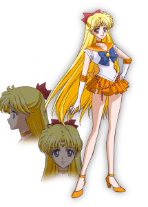
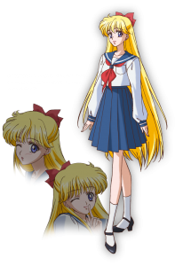
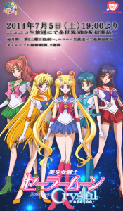
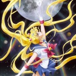
Following Sunday’s live event where the character art for the new series was revealed the Sailor Moon official site added more images of the characters. Here we have Sailor Moon, Mercury, Mars, Jupiter and Venus both in their Sailor Guardian costumes and as civilians Usagi, Ami, Rei, Makoto and Minako. There is also specific information about the show listed on the site. The series will premier July 5th 2014 7pm Japan Standard Time (6am Easter Standard Time) and will air once every 2 weeks. It has since been confirmed that the series will air for 26 episodes, which means it will run for a year.
Keep reading for the rest of the character art. What do you think of these designs?
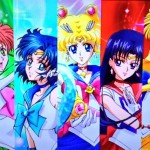
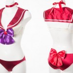
This final image appears to be fan made. I originally assumed it to be official based on the content. The art is from other images though.
Source: MoonSticks Facebook page.

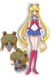
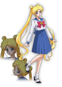
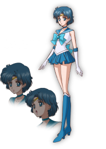
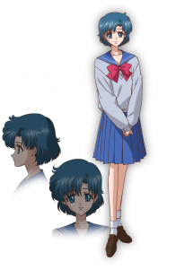
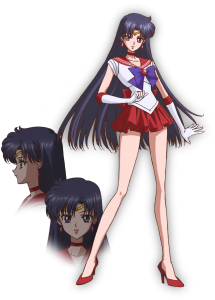
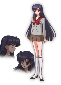
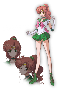
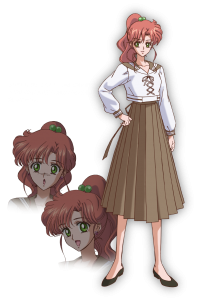
I’m not sure how I feel about them….but I’m pretty sue is going to be great on the tv.
I’m on the fence about them. While I appreciate that they’ve tried to bring the beautiful Manga art into motion, it looks like they’ll be awfully static.
My opinion may be influenced by my love for the original series mind you, and I’ll wait until the first episodes air before making final judgement, but I wish the designs were a bit more open to expression, which they don’t seem to be.
Additionally, they all look almost exactly alike minus hair and eye color.
I am in love with this art! I think it’s a wonderful blend of manga and anime… I am excited to see Venus’ Love-me Chain and Moon’s extra flair. The designs are just beautiful and it makes me that much more excited to see this series.
Love the Venus chain, wish Jupiter got hers too (and Mars’s little gem).
26 episodes only??? I was hoping for all 5 seasons not just 26 eps…
That’s 26 episodes for this season. There’s no word yet on whether or not we will get to see the other story Arcs… I would imagine it will have a lot to do with how the series performs. Once they see this season perform well, they’ll probably green light the rest.
I hope so… I want to see the new outers and Chibiusa-chan’s designs!
I love them. Especially Mercury!
I guess they omitted Jupiter and Mars’ accessories since they never play any real part in the story? I guess there’s still time to add them if they decide to…but I’m not going to complain if they don’t. Jupiter’s belt would be a pain to add in every frame.
I am happy to hear that it has 26 episodes, I had already figured they would do 13 or less, so 26 is a good surprise. I don’t think it needs 50+ like the original.
Don’t worry, willukea, almost every show is announced one season/series at a time. They’ve just announced that “Crystal” will be 26 episodes. If this does well enough we’ll almost certainly see more episodes late next year.
Let’s hope it gets renewed for a second season/series (and third, fourth fifth and beyond) when the time comes.
I wonder if there’s ever a beach episode in one the 26 episodes of Pretty Guardian Sailor Moon Crystal, if either Mina or Amy will be wearing a two-piece bikini besides Serena (Episodes 144, 183), Raye (Episode 144), Lita (Episodes 67, 183), and Rini (Episode 144)? I also hope it won’t end this year.
I’ve always loved Rei’s school uniform, and these look awesome! Can’t wait for July!! <3
Maybe I’m in the minority but I think this artwork is horrible. The character designer doesn’t even know how to draw hands!!! :O (And check out Venus’s glove trim that’s twisted in the opposite direction of her arm.) I dislike the design choices this person made, but that’s just my opinion. But I don’t think anyone can argue against the idea that anyone who’s allowed to “design” a Sailor Moon property should be expected to know how to draw hands.
I’m honestly stupefied that Ms. Takeuchi is allowing them to do this to the characters. If they’re this lax about the design, who knows what will happen when it comes to the writing…
I also don’t understand why they even needed to have a “character designer”? The artwork style Takeuchi herself used for the covers of the “kanzenban” reissues of the comics from 2003 would have worked perfectly for a cartoon—so much cleaner than this and much prettier! I wish she could have “designed” the characters herself.
Don’t worry, I do agree with you. And see Mars’ right foot, how it bends is embarrasing to even look at. I really REALLY hope the show itself has more fluid and consistent animation and style. But nitpicking aside, there just isn’t any soul in these pictures, with their eyes, expressions. Makoto is the worst in my opinion, and she’s my favorite girl.
There is also some conflict to making manga style into anime. While it could have been much worse, some of the “Takechi anatomy” look really out of place in these. In the manga they fit, it’s great art. In these, for example when Minako winks, the winking eye is wayyy up. When Takeuchi draws it, it just looks more natural. This art looks so much more “cleaner” and “real” it actually makes the anatomy really out of place and works to it’s disadvantage.
I do give the show ratings and watch it. And I appreciate the hard work to even get this far, final air date. But, yeah, here was my two cents about it.
Well, Takuechi’s art is without a doubt prettier. That’s to be expected, coming from the original artist.
She also has an art style that might not lend itself well to animation. It might be very difficult for animators to reproduce her flowing, detailed style consistently. That’s why you might need a character designer who can find some middle ground; a style that resembles the original style, yet is also easy for modern animators to work with.
It isn’t the best artwork ever, but I think we should wait until we see it in motion. Still pics don’t usually do animation justice. Also, what about Venus’s gloves? Are you talking about the orange donut rings around her elbow?
I thought I was the only who notice that hands! May be they did it fast to calm the audience but I agree with you on the old art being great it just need it a little clean up.
I honestly just think you aren’t used to the style, I’m looking at the hand and seems fairly typical style. All sorts of animations have simple flaws like that, and if are going to let something so minor bother you on incredibly lovely animation by a professional animation team (which I am fairly certain you don’t belong too) then maybe you just aren’t a fan of Sailor Moon enough. I personally like this style much more than the old style, it is much closer to the manga.
Just because it’s officially released material, doesn’t mean we have to bow down and praise it. It’s almost sickening that a professional team took life away from the characters we all knew and loved. And with the amount of errors in these new images, I don’t see myself supporting the new Sailor Moon. I am perfectly content with continuing to love the original manga and anime.
You’re completely correct. As far as I am concerned, there is no excuse for the blatant anatomical problems in these PROFESSIONAL, STATIC character portraits. But that is just me. And me? As an artist? I would never release artwork like this to the public, not for the 20th anniversary reboot of one of the most beloved magical girl shows of all time.
Takeuchi admitted herself that her artistic skills were not that good when she drew Sailor Moon, and yet instead of improving on her mistakes, they USED them. Those are Takeuchi hands all over the place and I am sorry, but they are terrible, horrible, and ugly. She has never been good at hands. Those legs are absurdly long, to the point of bordering on CLAMP-ridiculousness, and CLAMP, when animated with CLAMP style, looks … like vomit.
They could have used her style, but improved on it. :/
Some people think we’re just whining about this and hating on the new designs just because of nostalgia, but no, in my case I’ve always wanted to see Sailor Moon in HD with those bright colors they use nowadays. And yeah, we love the first anime, I mean the music, the key episodes, are things that can’t be re-done. But there is something that most people don’t realize: This new anime is not a High-End production. So, I wouln’t be surprised if the result is not that good. I think if they made a movie of the Stars arc of the manga with all the budget of this new series, THAT would be a good production.
Not a high-end production? Sailor Moon is one of the biggest and well known animes globally. What do you know? Do you work for Toei? Are you a personal friend of Naoko?
The problem is, it IS high-end, and it doesn’t even come close to looking like it is.
The thing that really turns me off those girls is their pencil thin necks… Especially in their school uniforms… urgh…
I love love love the art design for Crystal it’s soooooo awesome and I can’t wait for July I’m sooooo excited!!!!! Only 2 months left my fellow moonies!!!!!!!!
I’ll get over the artwork if the story follows closely along with the manga.. but what I want to know is, I know they’re showing it super early in the morning on nico nico.. and I doubt I’ll be able to pull myself out of bed that early( 2am for me) can we get on that website and watch it whenever or is it like tv where it’s on a specific time and if you miss it, you miss it? I’ve never used the nico nico website before.
Since the company is specifically subtitling this anime for release in different countries, I highly doubt they will only air episodes on Japan time. Most likely the show will be available for streaming afterward no matter what, and each time zone will probably get a broadcast time that works for them.
Another reminder, I hope the series won’t end next year in 2015.